Be The Brand
The future of construction is changing. The industry is moving toward smarter, systemic solutions rather than individual product offerings. ClarkDietrich is poised to become the industry’s benchmark, and we are ready to secure a seat at the table with those that will make a substantial difference in the appearance and the performance of all future buildings.
Our branding goal is clear: to define, support and deliver the ClarkDietrich brand message with one unified and unique voice. In all we do—in each and every visual or written communication—we must remain consistent in the ways we utilize and build on the distinct name of ClarkDietrich.
As a customer, publisher or supporter, we ask for your help in making ClarkDietrich Stronger than steel.
Below you will will find ClarkDietrich's Branding Styles. If you don't find what you're linking for or have a question for our Marketing Team, please use our feedback form to send us a message.
The ClarkDietrich logo
The ClarkDietrich logo is designed to reflect the simplicity, ease of use, and solid dependability of ClarkDietrich.
- EPS File Format = Adobe Illustrator CC 2015 for high quality print
- JPG File Format = Images (with white background) used for web, documents and presentations
- PNG File Format = Transparent Images (without background) used for web, documents and presentations
| Standard Logo | Stacked Logo | ClarkDietrich Icon Only | |
|---|---|---|---|
|
CMYK (For Print) |
|
 |
|
|
RGB (For Web & Docs) |
 |
 |
|
| Black-Flat |
 |
 |
|
|
White-Flat (Must be placed |
 |
 |
|
In either case, the logo must be used exactly as supplied. It is not permitted to deviate, in terms of positioning or proportion of the CD mark to the type, from the standard or stacked versions.
The standard version is preferred for most uses, such as collateral, certain promotional items (such as shirts), and signage. However, there will be the occasional application where the stacked version is more appropriate, such as on the front of a baseball cap. Especially when the print area is limited, the stacked version allows a greater overall size of the logo.
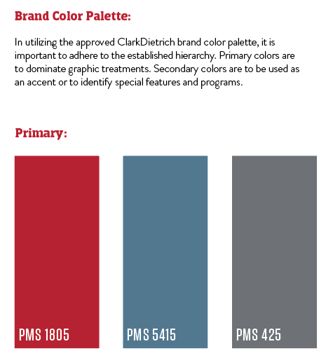
ClarkDietrich Colors

|
Solid Spot color and 4-color process. |
|
4-color process (C, M, Y, K) PMS 5415C C=65, M=34, Y=16, K=11 |
|
Web Based & Presentation Based PMS 5415C R=95, G=135, B=160 |
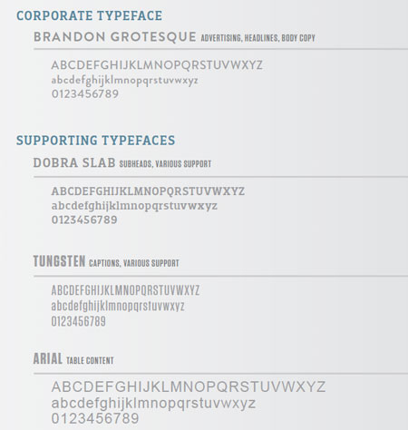
ClarkDietrich Typeface
The Brandon Grotesque font family is the approved ClarkDietrich brand font. It includes specific weights for headlines, body copy, and/or all other copy related usage. Type can be reversed out of a solid primary color and/or black, but cannot be placed over a product or logo. Preferred usage is PMS 425C on white background for text.


